Lab 3 Visualization and Statistical test
3.1 Objectives
After this section you should be able to:
- Plot and explore the data in many ways.
- Do statistical tests on the data.
3.2 Introduction
We will use the same data we already explored in last chapter. Remember: chickens weight, age (Time) for different diets.
There are many things we can explore in this data. Each question we might want to answer will be better addressed using different plots. For example: 1. If the chickens are older we expect them to be bigger. This can be visualized using a dotplot. 2. We might want to see the distribution of weight separated by diet. This can be addressed by a histogram.
3.3 Plots
We will use the package ggplot2. It is a very useful and documented package. We will focus on the ggplot function. This function generates plots as layers. This allows us to manipulate the colors, the plot type, etc. I know it can be difficult to understand it at the beginning but after a while it becomes really intuitive.
Important things to consider: 1. We will be able to plot anything that is a column in the data frame. 2. Everything is or can be a layer in the plot. 3. When you decide to color or shape by a factor that separates your data this will impact the plot.
Again,we can plot any column. So lets axplore the columns. It is important to know the class of each column. It is not the same trying to plot a number, than a letter.
## [1] "weight" "Time" "Chick" "Diet"## weight Time Chick Diet
## 1 42 0 1 1
## 2 51 2 1 1
## 3 59 4 1 1
## 4 64 6 1 1
## 5 76 8 1 1
## 6 93 10 1 1## 'data.frame': 578 obs. of 4 variables:
## $ weight: num 42 51 59 64 76 93 106 125 149 171 ...
## $ Time : num 0 2 4 6 8 10 12 14 16 18 ...
## $ Chick : Ord.factor w/ 50 levels "18"<"16"<"15"<..: 15 15 15 15 15 15 15 15 15 15 ...
## $ Diet : Factor w/ 4 levels "1","2","3","4": 1 1 1 1 1 1 1 1 1 1 ...
## - attr(*, "formula")=Class 'formula' language weight ~ Time | Chick
## .. ..- attr(*, ".Environment")=<environment: R_EmptyEnv>
## - attr(*, "outer")=Class 'formula' language ~Diet
## .. ..- attr(*, ".Environment")=<environment: R_EmptyEnv>
## - attr(*, "labels")=List of 2
## ..$ x: chr "Time"
## ..$ y: chr "Body weight"
## - attr(*, "units")=List of 2
## ..$ x: chr "(days)"
## ..$ y: chr "(gm)"3.3.1 Line and points
To see things as correlations, we usually use points and lines. We will see how to do it using different plot options.
Dot plot with basic qplot (from ggplot but les complex)
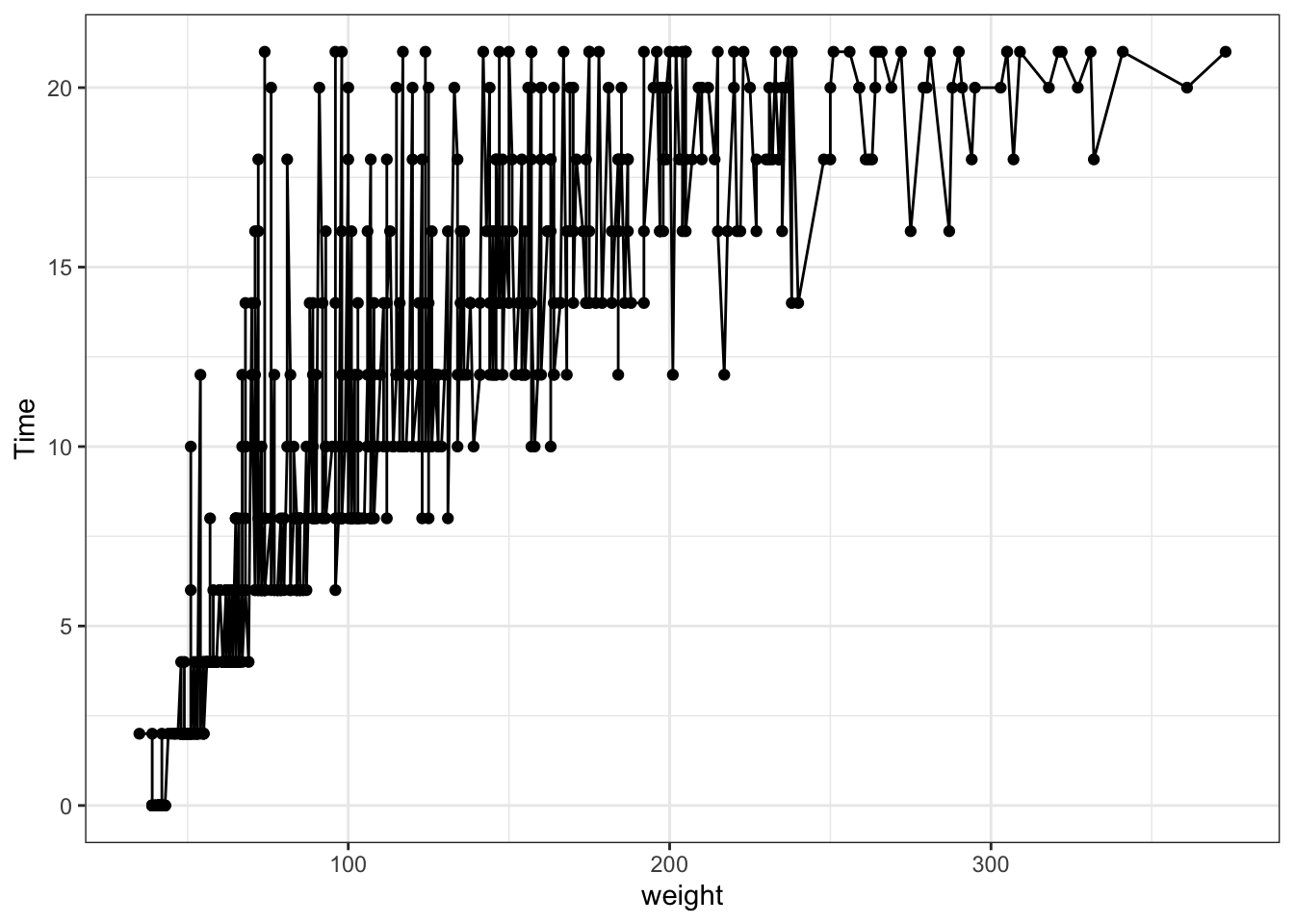
Figure 3.1: Point and line plots
qplot(data=ChickWeight,x = weight, y=Time, geom = c("line","point"), colour=Diet) #adding the color helps to separate the data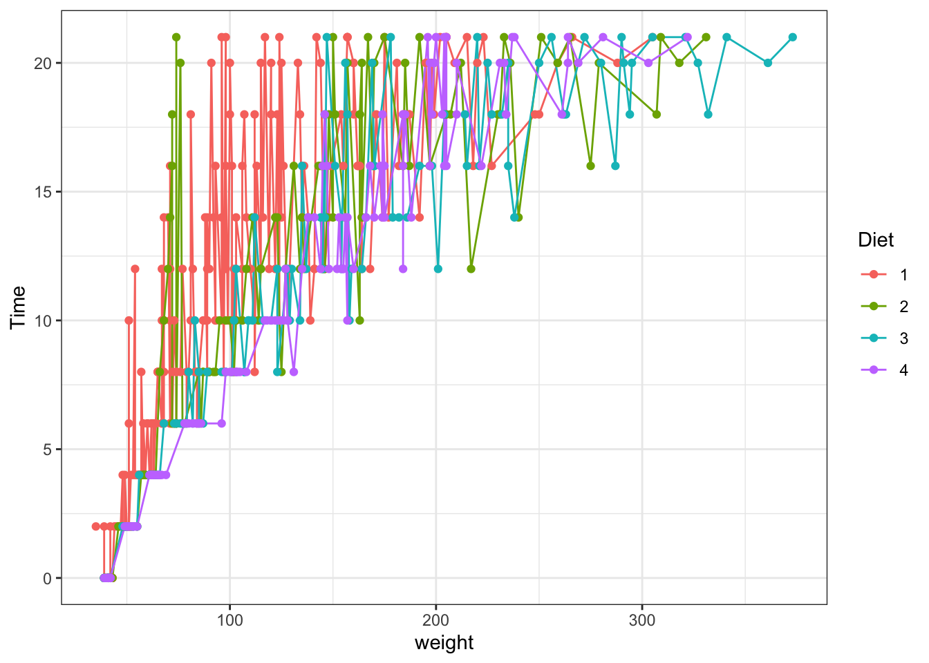
Figure 3.2: Point and line plots
The same using ggplot:
ggplot(data = ChickWeight, aes(y = weight, x=Time,colour=Diet))+ #data and basic things about the plot
  geom_point() + #add the type of plot
  scale_colour_brewer(palette = "Set1") #add a colot pallet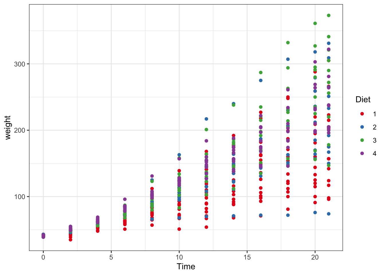
Figure 3.3: Point and line plots
ggplot(data = ChickWeight, aes(y = weight, x=Time,colour=Diet))+ #data and basic things about the plot
  geom_point() + #add the type of plot
  geom_smooth() + #add a trend line of mean plus se
  scale_colour_brewer(palette = "Set1")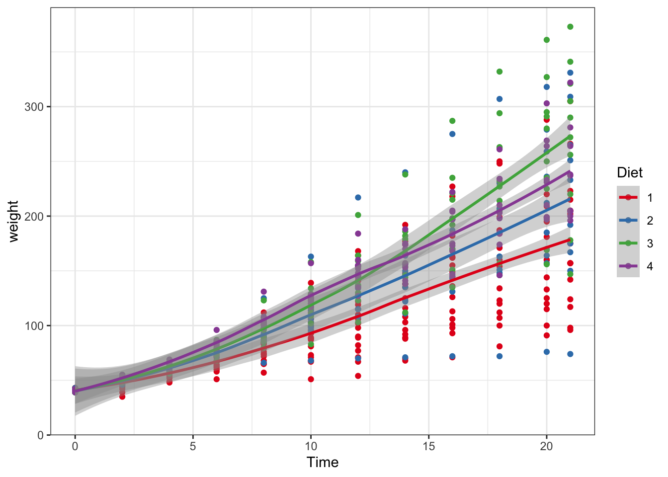
Figure 3.4: Point and line plots
3.3.2 Historgam and density plots
Histograms are used to represent the distribution of a variable over the population. If you want to read more you can go to this link. Other way to represent the same thing is to use cumulative plots we are not going to explore them now but if you are interested in doing them with ggplot you can go to this link
Density plots are similar to histograms but implies a more complex treatment of the data. They look like smooth histogram. They are the probability density function of the variable.
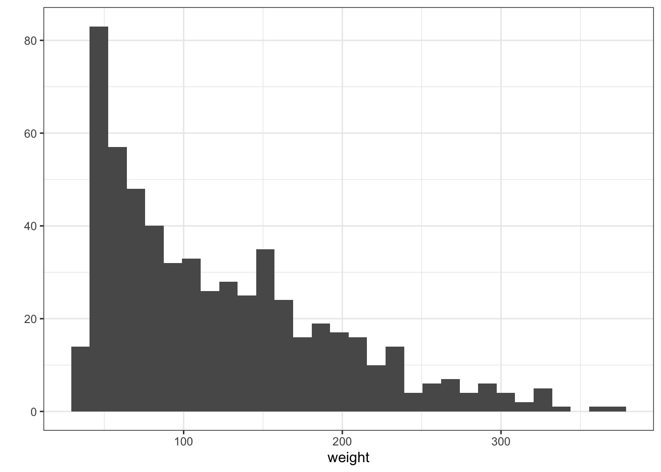
Figure 3.5: Histogram and Density plots
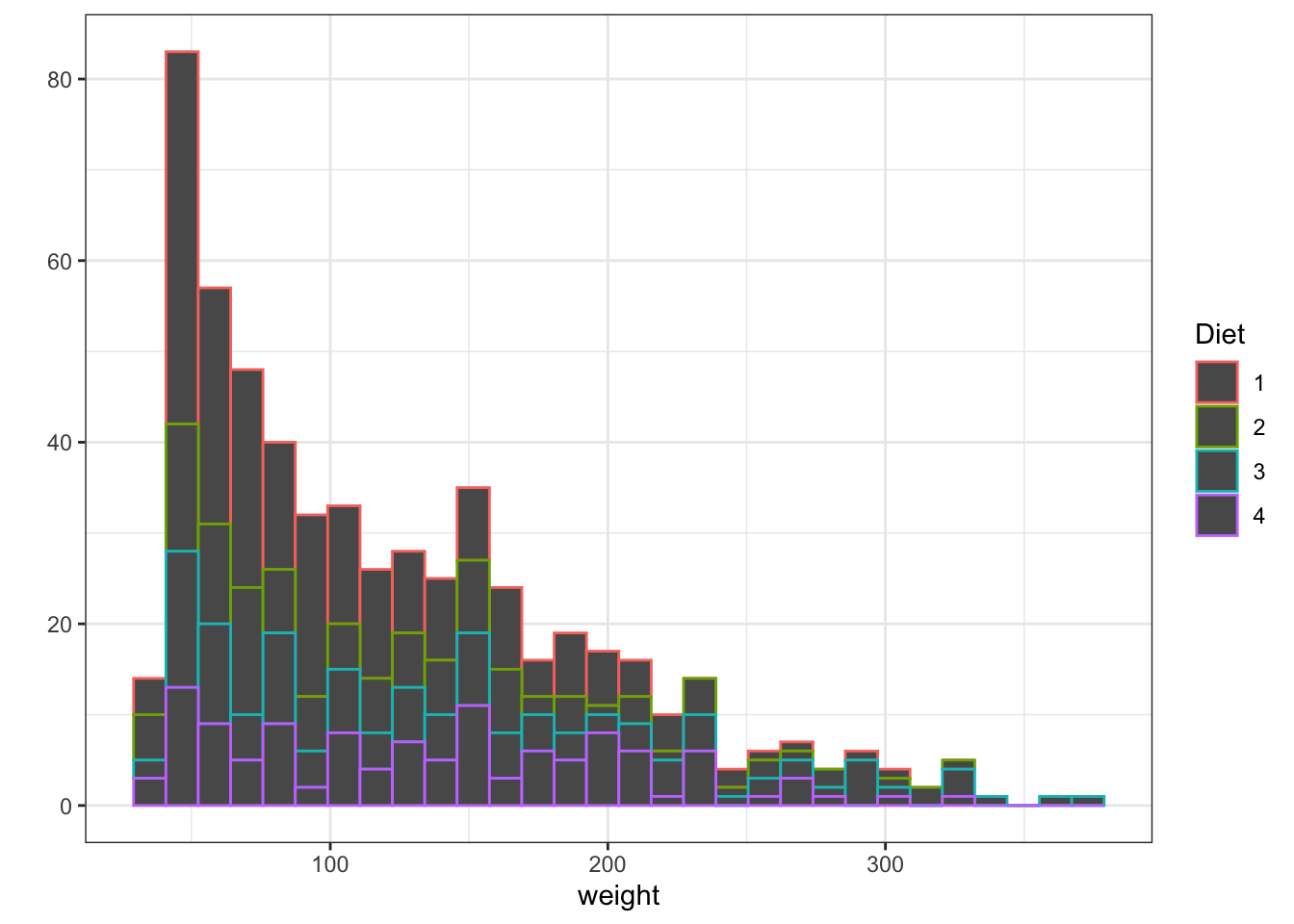
Figure 3.6: Histogram and Density plots
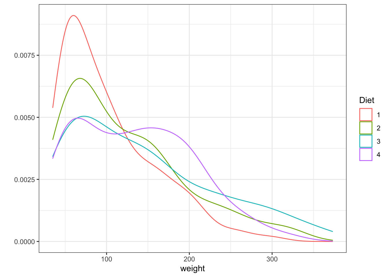
Figure 3.7: Histogram and Density plots
With ggplot
ggplot(data = ChickWeight, aes(x=weight,color=Diet))+
  geom_histogram(fill="white", position="identity")+
  scale_colour_brewer(palette = "Set1")#this is selecting the color scheme, try taking it out, or mofyfying it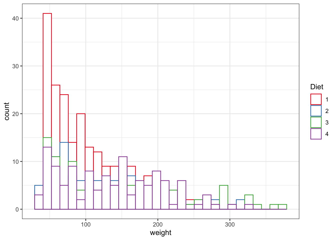
Figure 3.8: Point and line plots
ggplot(data = ChickWeight, aes(x=weight,fill=Diet))+
  geom_density( alpha=0.5)+ #the density plot with the option to modify the transparency of the polot solor, it goes between 0 and 1. Try modifying it.
  scale_colour_brewer(palette = "Set1")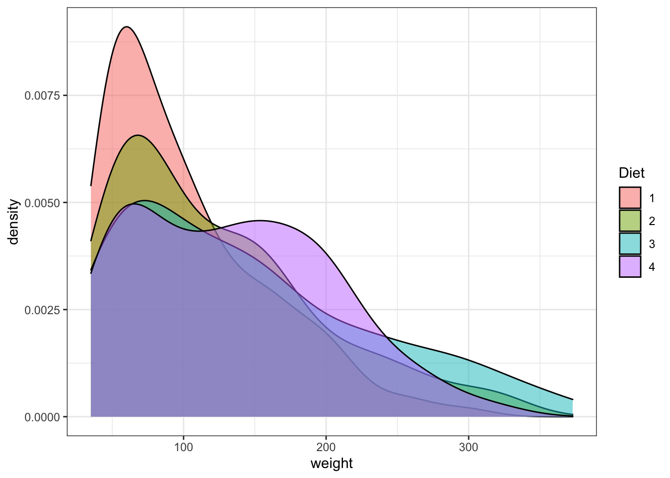
Figure 3.9: Point and line plots
3.3.3 Boxplot
Boxplots are a nice way to visualize the data distribution and to get and intuition of how this is different between conditions. As you can see in this figure, it summarizes a LOT of information:
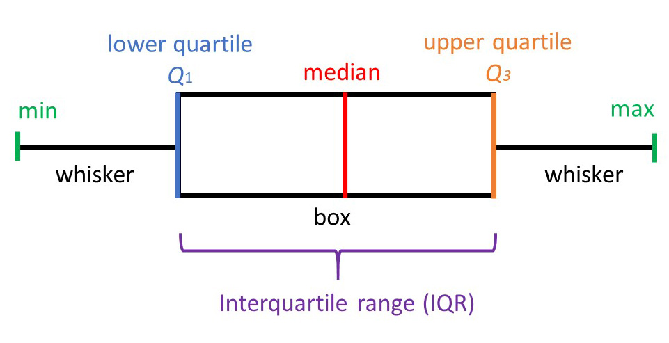
Figure 3.10: Boxplot description. Figrue affapted from https://www.simplypsychology.org/boxplots.html
ggplot(data = ChickWeight, aes(y=weight,x=as.factor(Time),fill=Diet))+ #Note how the x, y and color changes
  geom_boxplot()+ #this is adding the boxplot
scale_colour_brewer(palette = "Set1") 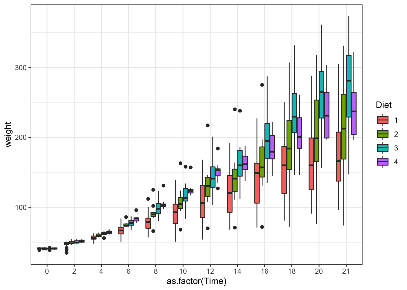
Figure 3.11: Boxplot
What happens if we do not use the as.factor? Again, a reminder that the data type is important!
ggplot(data = ChickWeight, aes(y=weight,x=Time,fill=Diet))+
  geom_boxplot()+ #this is adding the boxplot
  scale_colour_brewer(palette = "Set1")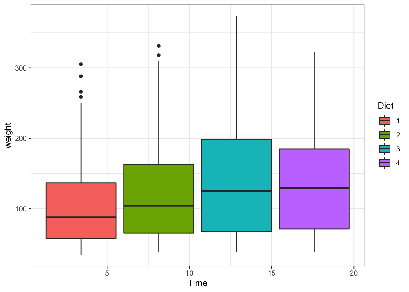
Figure 3.12: Boxplot
It seems interesting to separate this by age (Time). This is achieved by another layer named facet.
ggplot(data = ChickWeight, aes(x=weight,fill=Diet))+
  geom_density( alpha=0.5)+
  scale_colour_brewer(palette = "Set1")+
  facet_wrap(~Time,scales = "free") #This will separate the data into panels given the time, try looking for the meaning of the scale option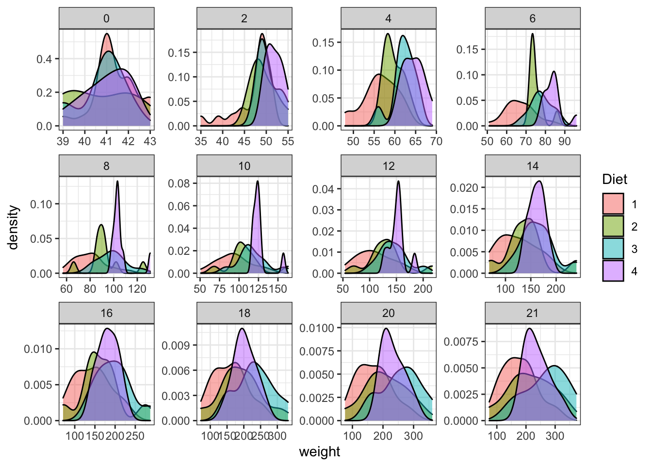
Figure 3.13: Plot separating by age of the chicken
ggplot(data = ChickWeight, aes(y=weight,x=as.factor(Time),fill=Diet))+
  geom_boxplot()+scale_colour_brewer(palette = "Set1")+
  facet_wrap(~Time,scales = "free")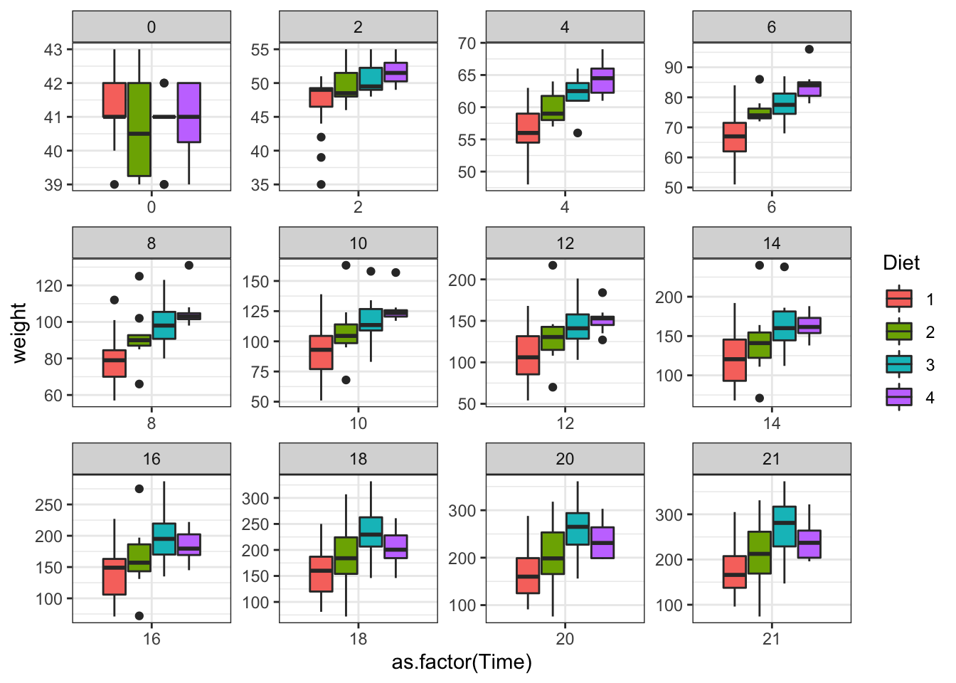
Figure 3.14: Plot separating by age of the chicken
ggplot(data = ChickWeight, aes(y=weight,x=as.factor(Time),fill=Diet))+
  geom_violin()+
  scale_colour_brewer(palette = "Set1")+
  facet_wrap(~Time,scales = "free")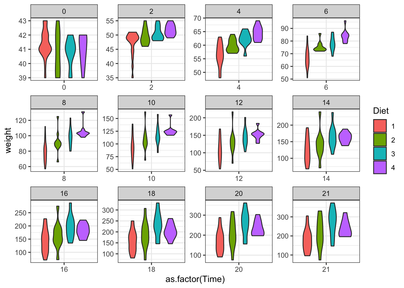
Figure 3.15: Plot separating by age of the chicken
3.3.4 Saving plots
Imagine you want now to save some of these plots. You can use the button export in RStudio. But you can also use the pdf function.
This function allows us to determine the width and height of the plots. Check what happens if you modify the option in the plots below.
These pdf files will be saved on your working directory with the name, width and height determined in the function.
Important things:
- Do not forget to put the “.pdf” at the end of the file name. What do you think it will happen if you forget it?
- When you finish running the plots that you want to be in the pdf file, you have to run
dev.off(). This will close the plot. If you forget this, you will not be able to open the plot.
pdf("densityplot.pdf",width = 20, height = 20) #save the plot as a pdf, control width and height of the pdf
ggplot(data = ChickWeight, aes(x=weight,fill=Diet))+
  geom_density( alpha=0.5)+
  scale_colour_brewer(palette = "Set1")+
  facet_wrap(~Time,scales = "free")

dev.off() #end the plot


pdf("density_and_violin.plot.pdf",width = 20, height = 20) #save the plot as a pdf, control width and height of the pdf
ggplot(data = ChickWeight, aes(x=weight,fill=Diet))+
  geom_density( alpha=0.5)+
  scale_colour_brewer(palette = "Set1")+
  facet_wrap(~Time,scales = "free")

ggplot(data = ChickWeight, aes(y=weight,x=as.factor(Time),fill=Diet))+
  geom_violin()+
  scale_colour_brewer(palette = "Set1")+
  facet_wrap(~Time,scales = "free")

dev.off() #end the plot
## quartz_off_screen
## 2
## quartz_off_screen
## 23.4 Statistical test
3.4.1 Descriptive statistics
We already saw a way to get the descriptive stats from a table by using summary.
We will try to compare the weight of chickens under different diets without considering the age.
First, we will now do a mean and SD table for each diet. There is one function that can do this for us.
ddply is a function that first divides the data by a variable written as .(Var) and then perform an specific function. With the indication of “transform” this will create a new column in out data
stat_ChickWeight<-ddply(ChickWeight,  .(Diet),  transform,  Mean=mean(weight,na.rm = T), SD=sd(weight,na.rm = T))

head(stat_ChickWeight)
## weight Time Chick Diet Mean SD
## 1 42 0 1 1 102.6455 56.65655
## 2 51 2 1 1 102.6455 56.65655
## 3 59 4 1 1 102.6455 56.65655
## 4 64 6 1 1 102.6455 56.65655
## 5 76 8 1 1 102.6455 56.65655
## 6 93 10 1 1 102.6455 56.65655Is this what we wanted? What happens if instead of “transform” we use “summarize”? Check
?ddplyfor more detail.
statWeight_ChickWeight<-ddply(ChickWeight,  .(Diet),  summarise,  Mean=mean(weight,na.rm = T), SD=sd(weight,na.rm = T))

head(statWeight_ChickWeight)
## Diet Mean SD
## 1 1 102.6455 56.65655
## 2 2 122.6167 71.60749
## 3 3 142.9500 86.54176
## 4 4 135.2627 68.82871This is usefull for ploting, here a good plot:
ggplot(statWeight_ChickWeight, aes(x=Diet, y=Mean, fill=Diet)) +
   geom_bar(stat="identity", position=position_dodge()) +
  geom_errorbar(aes(ymin=Mean-SD, ymax=Mean+SD), width=.2,
                 position=position_dodge(.9))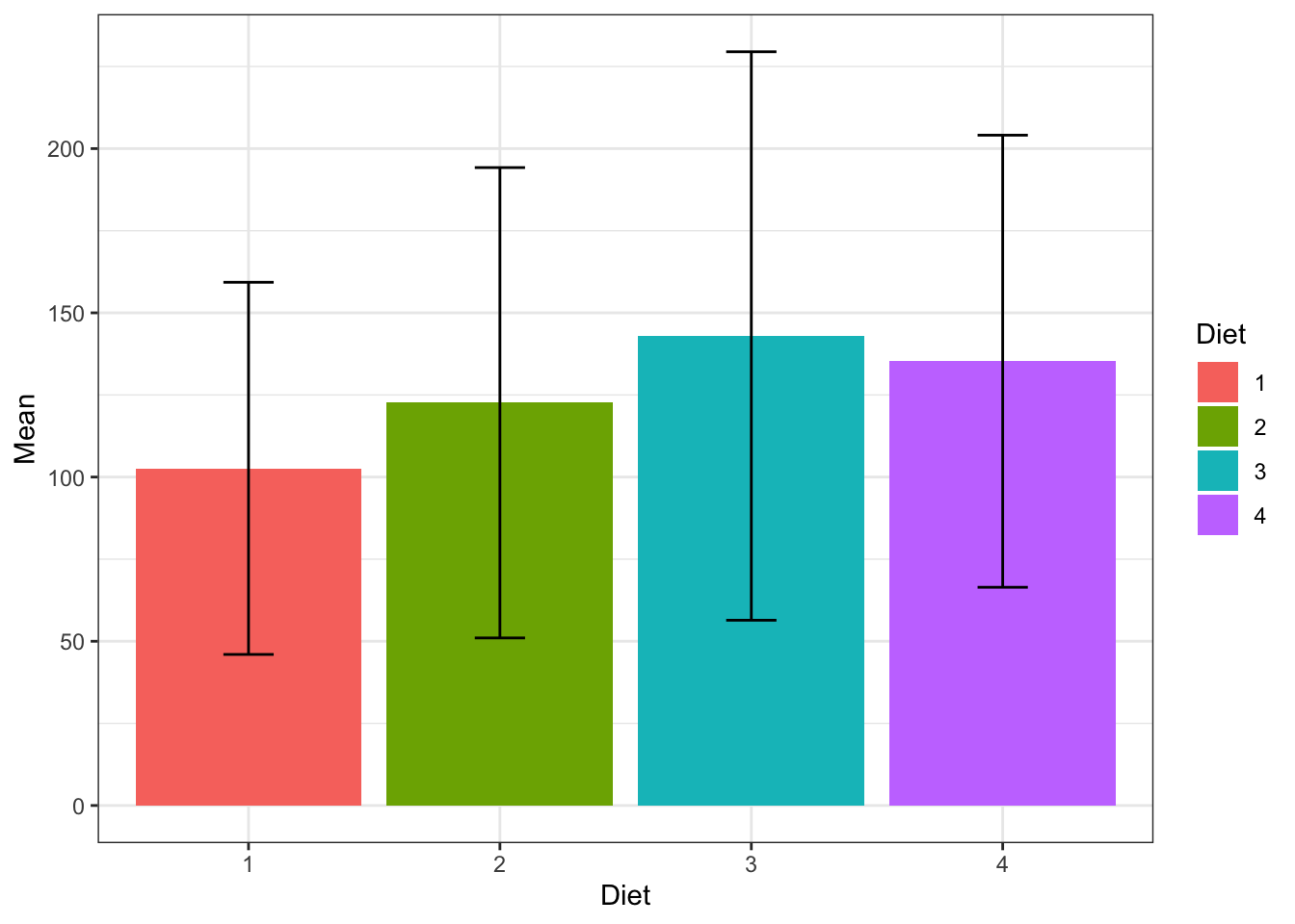
Figure 3.16: Boxplot
3.4.2 T-test/Wilcoxon
To compare means we can do a T test but to do this we need to test the assumptions of this test: Normality of the data and Homoscedasticity (ie, the variance is similar between the two groups we want to compare)
Question : Is there any significant difference in the weights between diet 1 and 3? Preliminary test to check independent t-test assumptions
Assumption 1: Are the two samples independents? Yes, they are two different samples
Assumption 2: Are the data from each of the 2 groups follow a normal distribution?
Shapiro-Wilk normality test for the different diets
##
## 	Shapiro-Wilk normality test
##
## data:  ChickWeight$weight[ChickWeight$Diet == 1]
## W = 0.89336, p-value = 2.211e-11
The function with allows us to do a simpler writing
##
## 	Shapiro-Wilk normality test
##
## data:  weight[Diet == 1]
## W = 0.89336, p-value = 2.211e-11##
## Shapiro-Wilk normality test
##
## data: weight[Diet == 2]
## W = 0.90399, p-value = 3.159e-07pvalue < 0.05, these are not normally distributed. We can NOT use t-test here. If we remember the histograms, this makes sense.
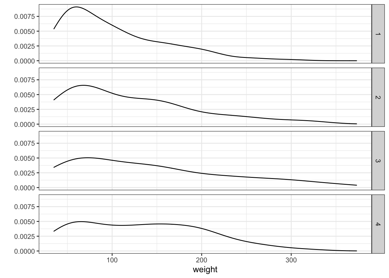
Figure 3.17: Density plot sepparated by Diet type
Assumption 3: Do the two populations have the same variances?
We’ll use F-test to test for homogeneity in variances. This is implemented by a function named var.test. This will require you to have which variable you want to test and separated by which variable.
This is clearly also not homoscedastic.
##
## 	F test to compare two variances
##
## data:  weight by Diet
## F = 0.62601, num df = 219, denom df = 119, p-value = 0.002928
## alternative hypothesis: true ratio of variances is not equal to 1
## 95 percent confidence interval:
##  0.4525703 0.8530014
## sample estimates:
## ratio of variances
##           0.626013
What happens if you try to run this
var.test(weight~ Diet, data = ChickWeight)?
We will use then Wilcoxon.
##
## 	Wilcoxon rank sum test with continuity correction
##
## data:  weight by Diet
## W = 11213, p-value = 0.02181
## alternative hypothesis: true location shift is not equal to 0
Are them different?
3.4.3 Anova/Kruskal–Wallis
Another way to test differences is to do an ANOVA or its non-parametric alternative Kruskal–Wallis. We already know that this data cannot be analyzed using parametric test as anova. But let’s explore just for fun.
Let’s check all the diets together
# Compute the analysis of variance
res.aov <- aov(weight~ Diet, data = ChickWeight)
# Summary of the analysis
summary(res.aov)
## Df Sum Sq Mean Sq F value Pr(>F)
## Diet 3 155863 51954 10.81 6.43e-07 ***
## Residuals 574 2758693 4806
## ---
## Signif. codes: 0 '***' 0.001 '**' 0.01 '*' 0.05 '.' 0.1 ' ' 1We see that the diet is a significant component of the variance of the data. Now we should know from where it is coming. We need to do a multiple pairwise-comparison. We will use Tukey Honest Significant Difference for this.
##   Tukey multiple comparisons of means
##     95% family-wise confidence level
##
## Fit: aov(formula = weight ~ Diet, data = ChickWeight)
##
## $Diet
##          diff         lwr      upr     p adj
## 2-1 19.971212  -0.2998092 40.24223 0.0552271
## 3-1 40.304545  20.0335241 60.57557 0.0000025
## 4-1 32.617257  12.2353820 52.99913 0.0002501
## 3-2 20.333333  -2.7268370 43.39350 0.1058474
## 4-2 12.646045 -10.5116315 35.80372 0.4954239
## 4-3 -7.687288 -30.8449649 15.47039 0.8277810
However, you should be screaming at me now: I did not check the assumptions!
- Homogeneity of variances:
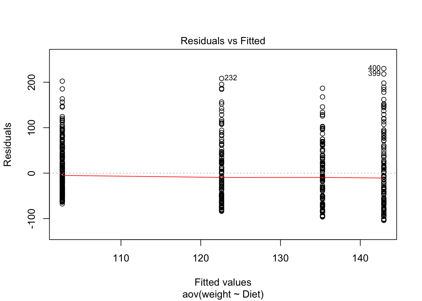
Figure 3.18: Residuals vs Fitted
## Levene's Test for Homogeneity of Variance (center = median)
##        Df F value    Pr(>F)
## group   3  9.6001 3.418e-06 ***
##       574
## ---
## Signif. codes:  0 '***' 0.001 '**' 0.01 '*' 0.05 '.' 0.1 ' ' 1
We have just found what we already know. The variance is not homogeneous. The variance across groups is statistically significantly different.
- Normality of the residuals:
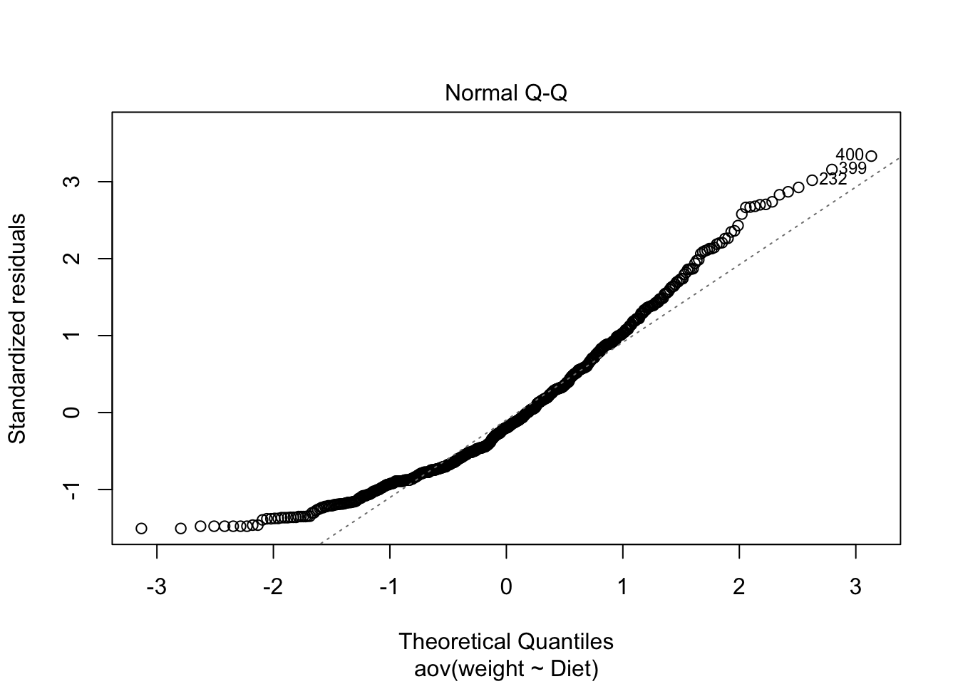
Figure 3.19: QQ plot
# Extract the residuals
aov_residuals <- residuals(object = res.aov )
# Run Shapiro-Wilk test
shapiro.test(x = aov_residuals )
##
## Shapiro-Wilk normality test
##
## data: aov_residuals
## W = 0.94065, p-value = 2.014e-14Non parametric then:
##
## 	Kruskal-Wallis rank sum test
##
## data:  weight by Diet
## Kruskal-Wallis chi-squared = 24.45, df = 3, p-value = 2.012e-05
What would you conclude about this data?
3.5 Activity:
Find another thing you want to test with this data. Solve this in a graphical and statistical way. Save the plots
3.6 Resources
- Statistics with R: https://cran.r-project.org/doc/contrib/Seefeld_StatsRBio.pdf
- Stat and plots with R: http://www.sthda.com/english/